I found there weren’t any good resources online that had clear instructions on how to process .nc and .nc4 files through Python, so I thought I’d make a post about it myself.
What are .nc and .nc4 files?
First, it’s important not to get these files confused with NC (Numerical Control) files which are used in machining tools and 3D printers. NetCDF or Network Common Data Form files are a type of file built for array-oriented scientific data1. The files contain a header with metadata that describes the contents of the file which allows researchers to get important insights into the data they’re looking at. The format of these files allows for storing large amounts of data in a structured format (so be ready for big files – no CSV nonsense). NetCDF files are mostly used in climate models, but there are some biology based uses for the files.2 For the use cases we will be looking at it will always be climate based so we will often see variables for things like time, latitude, longitude, temperature etc. Some examples of groups that use netCDF files are: NOAA, NASA, NCAR, SCRIPPS Institute of Oceanography, Neuro-Imaging Laboratory of Montreal Neurological Institute, and many more!3
How is data organized in a NetCDF file?
On a very surface level, data in NetCDF files are built up with 4 components4:
- Dimensions:
Dimensions are what define the array’s axes and are what determine their sizes. They often represent the independent variables recorded in experiments, so you will often find things like “time”, “longitude”, and “latitude” within the set of dimensions in a NetCDF file. The dimensions also are what you can use to define the shape of the variables. - Variables:
Variables are the main component of data within NetCDF files. The variables are what actually store the data values. They are made up of one or more dimensions and can be represented by a wide variety of data types like integers, floats, strings, etc. Variables are the dependent variables that we are observing. - Groups:
Groups are an organizational tool to place sets of variables together. They allow for much more complicated organization of data which we will not be going over in this intro post. - Attributes:
Attributes are the tags attached to our dimensions, variables, and groups that give us metadata regarding each unit.
The most confusing part of NetCDF files is that what they call variables are really full arrays. What’s important to remember is that NetCDF files are basically just fancy arrays. You can think of dimensions as axes that “variables” can choose from. Then variables are arrays that choose specific dimensions to define their structure.
Understanding our data in Python!
Since we will be working with climate data I recommend using the packages that I’m using, but if you’re using it for other research topics feel free to leave some packages out (like Cartopy – discussed later).
To get started, let’s find some data. At the bottom of the page in the “Resources” section I’ve attached a link to the data we will be using, or you can click here.
This data set provides ocean data from NASA which looks at 24 hours of various ocean recordings from August 1st 2018, and August 1st 2021.
The first thing we want to do is import our packages:
# reads the .nc and .nc4 files
import netCDF4 as nc

# visualizes the data
import matplotlib.pyplot as plt

#processes the data
import numpy as np

# helps visualize the data
import cartopy.crs as ccrs
from cartopy.mpl.geoaxes import GeoAxes
All of these packages can be simply downloaded with pip, or you can check there websites in the “Resources” section at the bottom of this post. Now onto actual code! First we need to get the data and then let’s take a look at some basic info regarding our data.
f = nc.Dataset('Data/2018/tavg1_2d_ocn_Nx-202109201458output.17833.webform.nc4', 'r')
print(f)
Which gives the following output:
<class 'netCDF4._netCDF4.Dataset'>
root group (NETCDF4 data model, file format HDF5):
    Conventions: COARDS
    calendar: standard
    comments: File
    model: geos/das
    center: gsfc
    dimensions(sizes): time(24), longitude(1152), latitude(721)
    variables(dimensions): float64 time(time), float64 longitude(longitude), float64 latitude(latitude), float32 tdrop(time, latitude, longitude), float32 tbar(time, latitude, longitude), float32 tskinice(time, latitude, longitude), float32 rainocn(time, latitude, longitude), float32 delts(time, latitude, longitude)
    groups:
Here we can see some of the metadata that we talked about at the start of this post and it gives us some intel about the file we’re looking at:
- Conventions: COARDS
Tells us about the way the file’s content was written. The two most common netCDF conventions for climate are COARDS and CF. This won’t change the way you interact with the data too much, but COARDS is generally easier to read. - calendar: standard, comments: File model: geos/das,
center: gsfc
All of these descriptors are unique to this dataset and they let us know things like we’re using the Goddard Earth Observing System and Data Assimilation System developed at NASA, and the center is the Goddard Space Flight Center - dimensions(sizes): time(24), longitude(1152), latitude(721)
This let’s us know the dimensions that are at the disposal for the use of variables. You can think of these as a sort of class or trait that variables can have. - variables(dimensions): float64 time(time), float64 longitude(longitude), float64 latitude(latitude), float32 tdrop(time, latitude, longitude), float32 tbar(time, latitude, longitude), float32 tskinice(time, latitude, longitude), float32 rainocn(time, latitude, longitude), float32 delts(time, latitude, longitude)
This gives us a list of the type values for each of our variables, along with the set of the dimensions that variable uses. So if we look at float64 longitude(longitude) we can see that the variable type is stored as a 64-bit float, and the only dimension it “uses” is the longitude dimension (as seen in the above bullet point. If we look at float32 tskinice(time, latitude, longitude) we can see the values are stored as 32-bit floats and they use all three of the time, latitude and longitude dimensions.
To help get a list of all the variable names we can do the following command.
print(f.variables.keys())print(f.dimensions['time'])
print()
print(f.variables['tskinice'])<class 'netCDF4._netCDF4.Dimension'> (unlimited): name = 'time', size = 24
<class 'netCDF4._netCDF4.Variable'>
float32 tskinice(time, latitude, longitude)
comments: Unknown1 variable comment
long_name: sea_ice_skin_temperature
units:
grid_name: grid01
grid_type: linear
level_description: Earth surface
time_statistic: instantaneous
missing_value: 1000000000000000.0
unlimited dimensions: time
current shape = (24, 721, 1152)
filling on, default _FillValue of 9.969209968386869e+36 usedIt’s important to not get mixed up between the dimension named “time” and the variable also named “time” which is why it’s good to keep track of what method you’re using when calling each variable/dimension. But this is a great way to get some more insight on how your variables are processed like it’s long name (sea ice skin temperature) , or what values are used in place of missing values (1000000000000000.0 in this case).
If you want to get a sense of the data itself you can slice the data and take a peek at what lies there.
print(f.variables['latitude'][:])[[[-- -- -- ... -- -- --]
[-- -- -- ... -- -- --]
[-- -- -- ... -- -- --]
...
[273.14825439453125 273.14825439453125 273.14825439453125 ...
273.14825439453125 273.14825439453125 273.14825439453125]
[273.14825439453125 273.14825439453125 273.14825439453125 ...
273.14825439453125 273.14825439453125 273.14825439453125]
[273.14825439453125 273.14825439453125 273.14825439453125 ...
273.14825439453125 273.14825439453125 273.14825439453125]]Just to fully get an understanding of how NetCDF files are organized let’s look at the shape of the array when we take a look at our data at hour 0.
print(f.variables['tskinice'][:].shape)(721, 1152)As you can see this matches the shape of the array from before without the “24” for the number of hours.
Visualizing our data!
Okay, so this is what you really came for. If you are new to NetCDF files and have jumped to this part, firstly, I totally understand, but I would recommend reading the earlier stuff just to get an understanding of how these files work. But I digress. Without further ado, let’s jump into this!
For visualizing our data because it is geographic data we will be using cartopy and it’s library extension GeoAxes along with matplotlib.
lat = f.variables['latitude'][:]
lon = f.variables['longitude'][:]
hour_0_ice_data = f.variables['tskinice'][0, :, :]

plt.figure(figsize = (15, 5))

# Defining and plotting our map with a standard Plate Carrée projection
ice_map = plt.axes(projection=ccrs.PlateCarree())
im = ice_map.pcolormesh(lon, lat, hour_0_ice_data, transform = ccrs.PlateCarree())

# Making a colour bar
cbar = plt.colorbar(im, label=f.variables['tskinice'].units)

# Creating helpful titles!
cbar.set_label('Sea Ice Skin Temperature (K°)', rotation = 270, labelpad = 15)
ice_map.set_title('Sea Ice Skin Temperature Projected onto a Worldmap 2018')

# I left this in in case the map is not well defined or the data is incomplete
# ice_map.coastlines()

plt.show()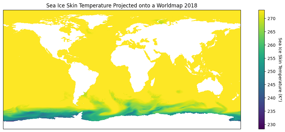
Wow! That looks great, and what’s more is that there are so many choices we can make to highlight different geographic attributes! When plotting our data our goal is to visualize in the best way possible our findings and that’s where the power of projections with cartopy come in.
Cartopy is great because you 25 different map projections you can choose from5. The most confusing part about using cartopy is applying the projections themselves. If we want to change how our data is projected we want to change the projection attribute in our plt.axes function, while keeping the transform attribute in our ice_map.pcolormesh function to PlateCarree().
In our data I notice that most of the sea ice seems to be surrounding the south pole, so let’s focus in on that part of the map. For this I will use an orthographic projection that is centered on the south pole, and project it onto our plate carrée map like so:
plt.figure(figsize=(12, 8))

# Using Orthographic projection centered at the South Pole
south_pole_map = plt.axes(projection = ccrs.Orthographic(central_longitude = 0, central_latitude = -90))

# Projecting the Orthographic projection onto a Plate Carrée map
im = south_pole_map.pcolormesh(lon, lat, hour_0_ice_data, transform=ccrs.PlateCarree())

# Adding our colour bar
cbar = plt.colorbar(im, label=f.variables['tskinice'].units)

# Setting our titles
south_pole_map.set_title('Sea Ice Skin Temperature Highlighting the South Pole')
cbar.set_label('Sea Ice Skin Temperature (K°)', rotation=270, labelpad=15)

plt.show()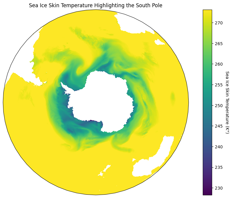
That looks incredible! The reason we have to do this is because Plate Carrée is the most basic type of projection since it flattens out the lines of latitude and longitude so that they create an equidistant grid across a plane6. As such, we want to project different map projections onto that stable grid.
I recommend playing around a lot more with different projections to see what kind of fun creations you can come up with!
Conclusion.
Yay, we’re done! This is obviously only a brief look into using NetCDF data, but it’s just about everything you need to get started into looking at these sorts of data files and getting your hands dirty.
We looked at how to import and process the files, how to gather the metadata on the dimensions and variables themselves, and how to start visualizing the data. The next steps are all up to you and depend on your project. I will be posting a follow up project looking at this specific dataset which I recommend you look at! I’ve also attached a bunch of further reading links below and hope that you are well on your way to analyzing some sweet earth data!
-Mako
Resources
Data:
https://www.kaggle.com/datasets/brsdincer/ocean-data-climate-change-nasa/data
Link to github with Jupyter Notebook Files and Data:
https://github.com/RaphaelMako/Intro-NetCDF-Files
Additional Resources:
Installation links:
numpy: https://numpy.org/install/
netCDF4: https://pypi.org/project/netCDF4/
matplotlib: https://matplotlib.org/stable/users/installing/index.html
cartopy: https://scitools.org.uk/cartopy/docs/latest/installing.html
Cartopy Projections:
https://scitools.org.uk/cartopy/docs/v0.15/crs/projections.html
Further:
https://en.wikipedia.org/wiki/Map_projection
https://climate.nasa.gov/vital-signs/arctic-sea-ice/
- https://en.wikipedia.org/wiki/NetCDF ↩︎
- https://climatedataguide.ucar.edu/climate-tools/NetCDF ↩︎
- https://www.unidata.ucar.edu/software/netcdf/usage.html ↩︎
- https://pro.arcgis.com/en/pro-app/3.1/help/data/multidimensional/essential-netcdf-vocabulary.htm ↩︎
- https://scitools.org.uk/cartopy/docs/v0.15/crs/projections.html ↩︎
- https://en.wikipedia.org/wiki/Equirectangular_projection ↩︎
Leave a Reply